Charts
Charts are used to plot the data values in a TMS report. A variety of types and themes are available for charts to provide the best representation of your data. The type and theme combination for the chart is set up and editable by the creator of the dashboard. (For information on creating and customizing dashboards, consult TMS Dashboard Administration.)
For more information see Chart Types and Chart Properties.
Refresh the Data
Charts have a refresh rate that determines how often the data is automatically refreshed. The last updated time is shown in the upper right corner of the chart.
Refresh Now can be used to force a manual refresh of the data without having to wait until the next automatic refresh.

Tabular Data
When viewing charts, tabular data broken down in grid form is also provided. To view the tabular data, click the arrow next to Tabular Data at the bottom of the chart. The Tabular Data area shows the report data in a format similar to what you would see when previewing a report in the TMS OnLine/OnSite application.
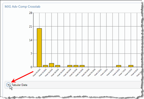
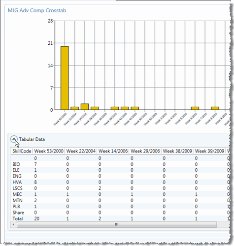
When you are finished viewing the data, you can click the arrow next to Tabular Data again to close it.
Transpose Data Table
Default Data Series
"Drill down" Reporting
In addition to allowing you to see a breakdown of the data presented in the chart above in a row/column format, the Tabular Data area allows you to "drill down" on a specific area of the data.
Ex: in the chart above, data is presented for multiple Skill codes. If we want to see the data for just the ELE code, we will click that code in the Tabular Data area. The chart will change to show only the data for that code.
If we want to see the data for a specific week, we will likewise click the week above one of the columns. Again, the chart will change to show just the data for that week.
If we click the Total entry in the last row of the table, we will again see all of the data sorted by the Week. If we click the Total column header at the far end of the table, we will see all data sorted by the Skill code.
"Drill down" reporting is also applicable to charts. For example, if you are viewing a pie chart you can click a segment (that is, a "slice") of the pie to display that drill down.
When you click in the chart, the drill down is highlighted in the tabular data. If you're using column labels, the column header is highlighted. If you're using row labels, the row of data is highlighted.
Notice that when you click a slice of pie to drill down, the Go Back button appears above the chart next to the report name after drilling down. You can click the Go Back button to return to show all of the data (the whole pie, as it were).

Series and Legend Data Labels
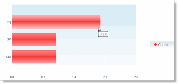
If you hover your mouse over an area of the chart or the chart's legend, you will see a label pop-up window that shows the data you are hovering over in numeric form.
For example, in the screen shot below, we have our mouse hovering over the bar for Request-type (RQ) work orders. The label that popped up, showed us that in this report, there are two work orders of the type Request.