Modify Report Fields
To start using the Designer,
click the Designerbutton
 . The C1ReportDesigner window consists of three main areas: the Reports
list, Property Wndow,
and the Preview/Design pane.
The Reports list
appears above the Properties Window on the left of your
screen. On the right, the report Preview/Design pane is the main working area of the Designer.
. The C1ReportDesigner window consists of three main areas: the Reports
list, Property Wndow,
and the Preview/Design pane.
The Reports list
appears above the Properties Window on the left of your
screen. On the right, the report Preview/Design pane is the main working area of the Designer.
Notice that when you highlight a field in the Design pane, the attributes of that field are displayed in the Property Wndow.
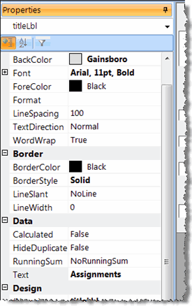
Primary Attributes in the Properties Window
-
Alignment - How the data is aligned (LeftTop, CenterTop, RightTop, etc)
-
CanGrow - The field expands as needed
-
Font - Font, Font style, Size, and Effects
-
ForeColor - The color of the text
-
Height - The standard height is 270
-
Name - The unique identifier for the field
-
Visible - Whether you can see this field or you can't
-
WordWrap - The field can grow from top to bottom as needed
Use the buttons in the Design ribbon to format the selected field.
The Format Toolbar
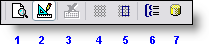
The Format toolbar contains tools for aligning, sizing, and spacing report fields. This toolbar is enabled only in design mode. The numbers in the screen shots below correspond to the buttons' descriptions below the screen shot.
-
The Preview button renders your report for viewing.
-
The Designer button switches to Design mode where you can modify your report. In this screen shot, theDesigner button is pressed, the main window is in mode.
-
The Cancel Rendering button is active after you click the Preview button.
-
The Show Grid button provides a grid that helps position controls at discrete positions. While the grid is on, the top left corner of the fields will snap to the grid when you create or move fields.
-
The Snap to Grid button causes the top left corner of the fields to snap to the grid when you create or move fields, if Show Grid is on
-
The Sorting and Grouping button is for adding and editing report groups.
-
The Data Source button is for adding and editing the data source properties (Step 1 in the TMS C1 Report Wizard).

Buttons 1 and 2. If some fields overlap, you can control their order using the Bring to Front/Send to Back buttons. This determines which fields are rendered before (behind) the others.
Buttons 3 - 17. When multiple fields are selected, you can use these buttons to align, resize, and space them. When you click any of these buttons, the last field in the selection is used as a reference and the settings are applied to the remaining fields in the selection.
The Toolbox
The numbers in the screen shots below correspond to the buttons' descriptions below the screen shot.

-
Choose the Selection tool to select a field.
-
The Add Label button creates a field that displays static text.
-
The Add Data button creates a data field.
-
The Add Calculated button creates a calculated (summary) field.
-
The Add Checkbox button creates a bound field that displays a boolean value as a check box. By default, the check box displays a regular check mark. You can change it into a option button or cross mark by changing the value of the field's check box property after it has been created.
-
The Add Unbound Picture button creates a field that displays a static picture, such as a logo.
-
The Add Bound Picture button creates a field that displays a picture (or object) stored in the record set.
-
The Add Line button creates a line.
-
The Add Rectangle button creates a rectangle. You can use rectangles to highlight groups of fields or to create tables and grids.
-
The Add Subreport button creates a field that displays another report.
-
The Add Page Break button creates a field that inserts a page break.